


Infinite colors for infinites stories
Each mosaic is the result of a precise balance between light, matter and colour. To give shape to your vision, we select only the highest quality materials, capable of combining technical excellence, aesthetic performance and durability over time. Venetian enamels, glass and natural stone form the basis of our creations. The enamels, hand-worked according to ancient artisan techniques, offer an intense brilliance and an almost infinite range of colours. Glass, thanks to its transparency and refractive capacity, adds depth and dynamism to every surface. Marble, with its unique veining and the solidity of natural stone, gives elegance and authenticity. These materials can be used individually or mixed together, to obtain contrasts, transitions or harmonious combinations tailored to each project. Our colour consultancy service supports you in defining the ideal palette, ensuring stylistic coherence and architectural enhancement.
Red Hues
Red tones range from intense ruby to earthier brick hues, bringing visual strength and depth to mosaic surfaces through the rich saturation of smalto.
Across its spectrum, red retains chromatic stability even under variable lighting, making it suitable for structural accents and dominant fields.


Thought that was all? Think again — the palette goes on!
Green Hues
From aqua green to deep forest tones, these hues evoke natural landscapes and offer chromatic balance—ideal for elegant and harmonious compositions.
Their versatility allows seamless integration with both warm and cool palettes, enhancing transitions and depth within the mosaic.


You’ve only scratched the surface — there’s a whole world of shades waiting.
Pink Hues
Pink gradients, whether soft or bold, introduce a sense of delicacy and brightness, enhancing light textures and subtle contrasts.
These tones are especially effective in capturing the subtle shadows and highlights of skin, allowing for realistic gradations that reflect depth and form.


Just when you thought you’d seen them all… there’s more!
Yellow Hues
Bright or warm, yellow tones reflect light intensely, adding brilliance and dynamism to decorative projects.
These hues are particularly effective in highlighting key elements of a mosaic, creating striking contrasts and emphasizing depth through the interplay of light and shadow.


Endless tones, endless possibilities – this is just the beginning.
Gold Hues
Precious and radiant, the gold variations—made with gold leaf applied between two layers of glass—enrich the mosaic with metallic reflections and luxurious accents, while preserving a strong link to Venetian mosaic tradition.


And no, it doesn’t end here — the spectrum is far richer than it seems.
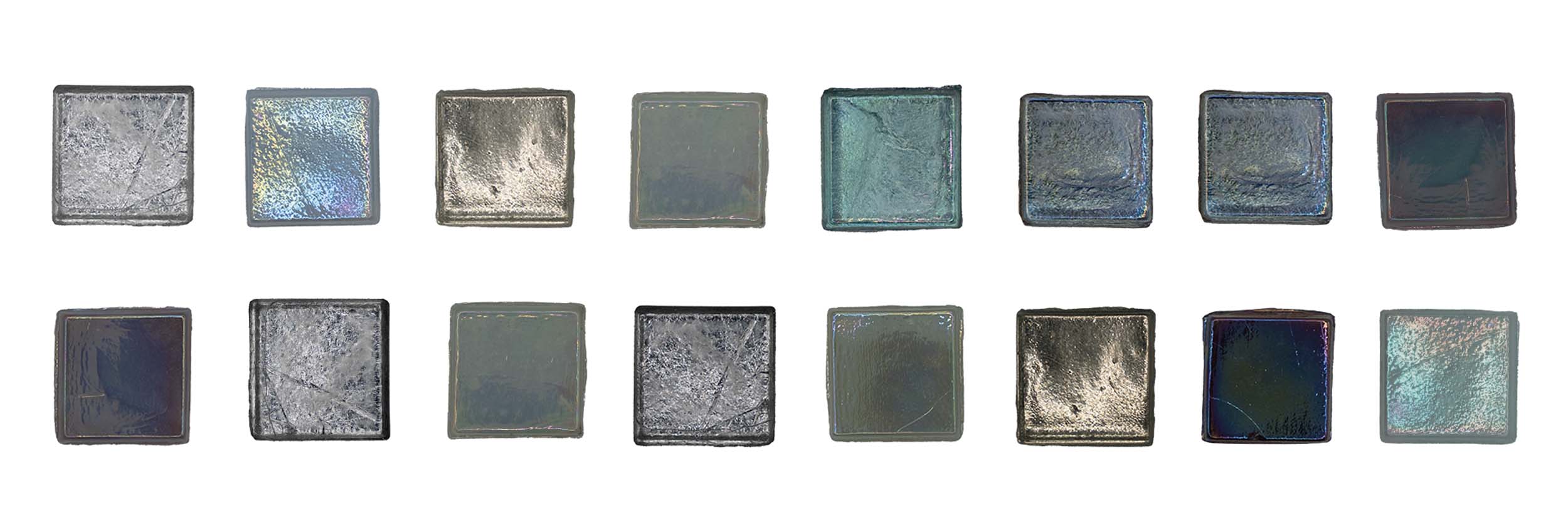
Silver Hues
Cool and refined, silver hues enhance light and movement, making them perfect for contemporary or minimalist settings.
Their reflective quality adds a sense of fluidity and elegance, allowing for dynamic shifts in visual interest as the angle of light changes.


Surprised? The color journey is just getting started.
Transparent Hues
Defined by their pure glassy material, these tesserae filter and refract light, creating visual depth and a sense of structural lightness.
The transparency of the glass enhances its ability to interact with surrounding elements, allowing light to pass through and shift, producing subtle gradations and a delicate play of reflections.


More shades, more depth, more to fall in love with.
Red Shades
Red glass, from crimson hues to deep garnet, brings chromatic intensity and rich transparency, ideal for creating bold and dynamic visual accents.
There are lighter or darker variants, both transparent and translucent, offering varying degrees of light and depth.


Thought that was all? Think again — the palette goes on!
Green Shades
Green variations, from sage to bottle green, evoke freshness and nature—perfect for spaces seeking a dialogue between material and landscape.
These hues, with their varying levels of saturation, provide chromatic stability and can be used to establish spatial depth, offering subtle contrasts and enhancing the material’s interaction with natural light.


You’ve only scratched the surface — there’s a whole world of shades waiting.
Pink Shades
Rosy hues, whether subtle or more saturated, add an ethereal and sophisticated touch, softly modulating the light.
Both pastel and more intense variations of these tones enhance the chromatic diversity of the mosaic, contributing to smooth transitions, subtle contrasts, and a balanced overall composition.


Just when you thought you’d seen them all… there’s more!
Yellow Shades
Bright and airy, yellow glass hues diffuse warmth and energy, creating vivid and luminous surfaces in any decorative setting.
From pale, soft yellows to more vibrant and intense shades, these glass shades add brightness and contrast to the project through their wide range of colors.


Endless tones, endless possibilities – this is just the beginning.
Gold Shades
Golden glass, achieved through special blends, lends elegance and a delicate iridescence, with reflections that shift depending on the light.
These golden shades bring a luxurious depth to the mosaic, enhancing the visual richness of the composition and creating dynamic variations in color as they interact with light.


And no, it doesn’t end here — the spectrum is far richer than it seems.
Silver Shades
Silvered glass, often finished with metallic treatments, offers mirror-like effects and optical plays—ideal for visually impactful applications.
These shades create striking reflections and enhance the overall composition with their polished surfaces, making them perfect for achieving metallic effects and adding a touch of sophistication to the design.

Surprised? The color journey is just getting started.
Transparent Shades
Crystal-clear and neutral, transparent varieties allow light to pass through the material, enhancing compositions and expanding spatial perception.
Transparent shades are available in all color variations, offering endless design possibilities while maintaining a sense of lightness and depth within the mosaic.


More shades, more depth, more to fall in love with.
Red Tones
Ranging from vibrant ruby reds to earthy terracotta, these tones add visual intensity and depth to surfaces, with the rich saturation enhancing the overall impact of the design.
These marble hues, characterized by natural veins and intricate patterns, bring a tactile richness to the composition, with their variations in tone and texture creating dynamic contrasts and a sense of permanence.


Thought that was all? Think again — the palette goes on!
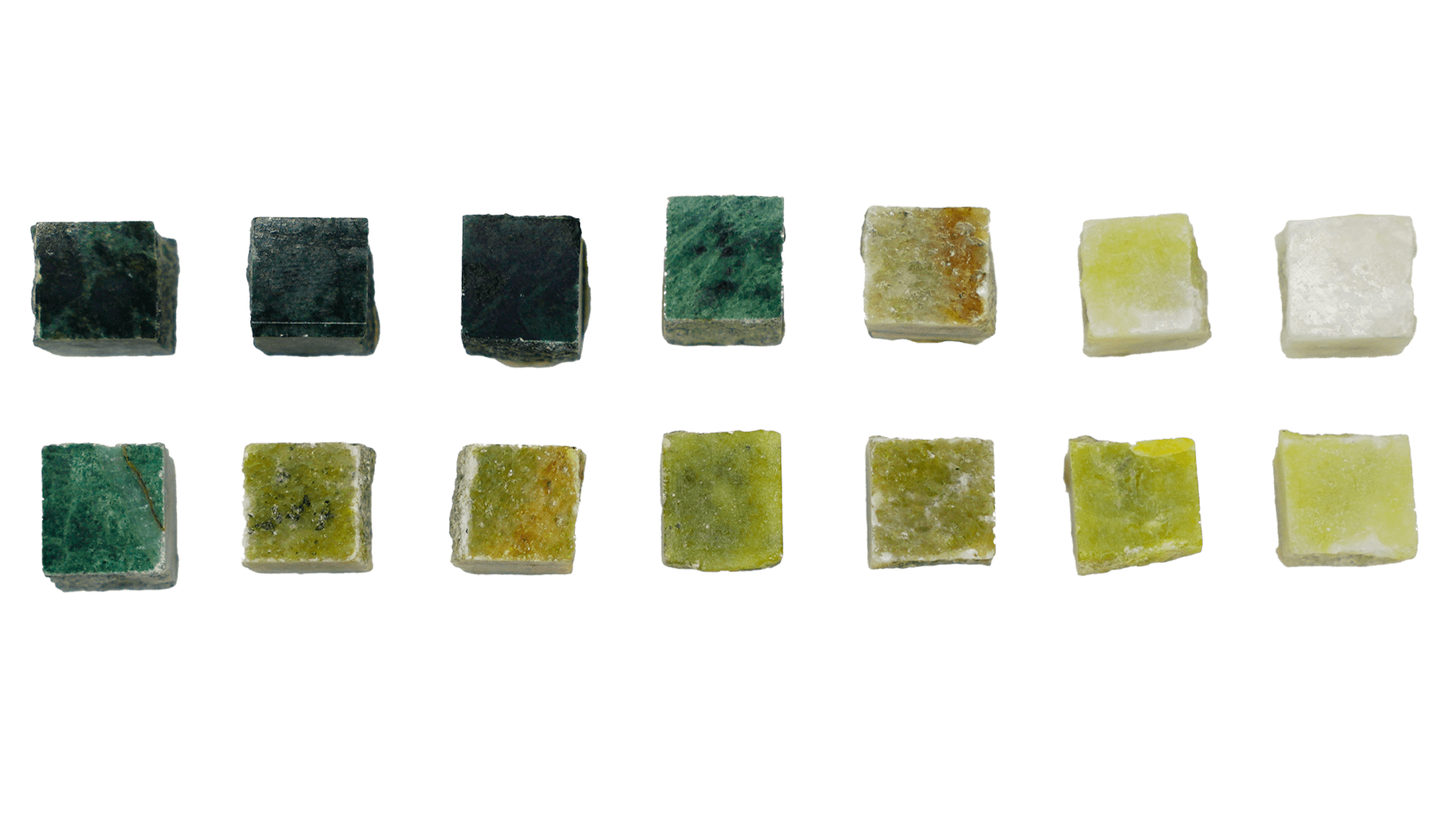
Green Tones
From aquamarine to deep forest greens, these shades evoke natural surroundings, offering a harmonious balance that’s perfect for creating elegant, calming compositions.
These marble tones, characterized by intricate veining and rich textures, add a sense of depth and organic movement to surfaces, creating a refined and sophisticated look while maintaining a connection to nature.

You’ve only scratched the surface — there’s a whole world of shades waiting.
Pink Tones
Pink shades, from soft pastels to bold hues, introduce softness and brightness, enhancing light textures and creating delicate contrasts that add warmth to the space.
These pink tones, ranging from subtle pastel pinks to deeper, bolder hues, are ideal for replicating a wide variety of skin tones, adding a natural warmth and depth to the mosaic, and creating a soft, harmonious contrast within the design.


Just when you thought you’d seen them all… there’s more!
Yellow Tones
Whether bright or warm, yellow tones reflect light with intensity, adding vibrancy and dynamism to designs, infusing spaces with energy and warmth.
These yellow hues, from soft buttery shades to deeper golden tones, bring a natural warmth to the surface, enhancing the overall composition by creating a lively, energetic contrast while maintaining a sense of harmony within the design


Endless tones, endless possibilities – this is just the beginning.
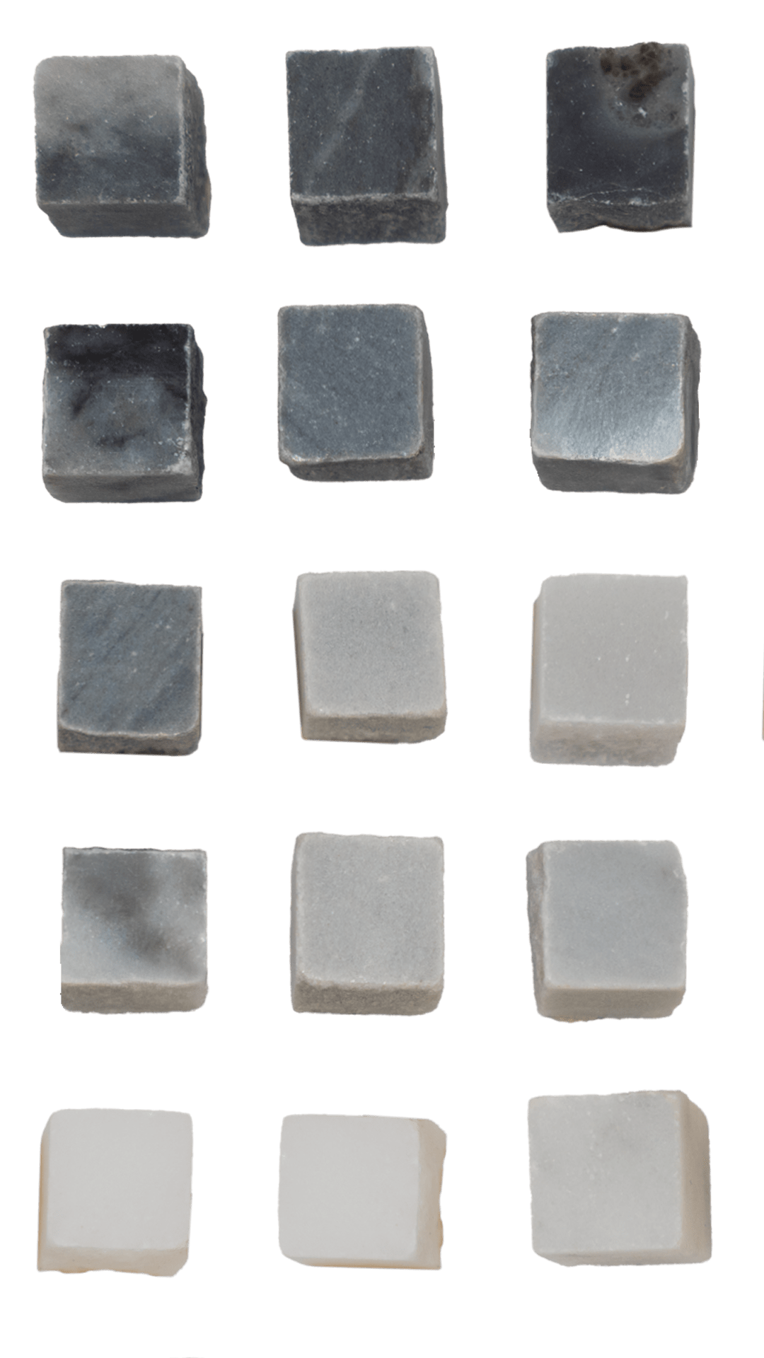
Gray Tones
The gray spectrum, from light to dark, brings a sense of sophistication and timeless elegance, providing a subtle yet powerful backdrop that complements any environment.
Ranging from misty, almost ethereal light grays to deep, shadowy hues, the gray spectrum adds depth and refinement to the design, offering a versatile base that enhances both contemporary and classic compositions.

And no, it doesn’t end here — the spectrum is far richer than it seems.
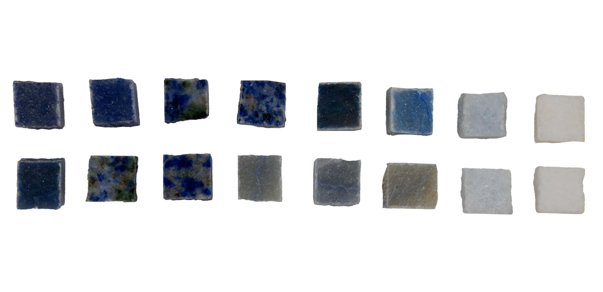
Blue Tones
From sky blue to deep navy, blue tones evoke tranquility and create a striking visual presence, ideal for building serene and refined atmospheres.
Ranging from soft, airy sky blues to rich, intense navies, these hues bring a sense of calm and stability, enhancing the design with their cool depth and elegant contrast, perfect for creating balanced and sophisticated compositions.

Surprised? The color journey is just getting started.
"The sound of the tiles, the hammer, and the chisel has been etched in my mind since the first moment I crossed the threshold of the mosaic school. Since then, it has remained in my heart, like an endless melody."
– Natalina Querin, Artistic Coordinator of Friul Mosaic

